There's a strange new problem in software this year.
The code works. The features ship. The backend is rock-solid. And yet half the products launching in 2026 look like they came out of the same factory. Same rounded cards. Same purple-to-blue gradient buttons. Same lonely emoji sitting next to the headline. Users see it within seconds, and they've already made a decision.
If you've noticed this, either as a builder or as someone landing on these sites, you already know why this article exists. Learning how to make an app look professional has quietly become one of the most valuable skills a non-designer founder can develop in 2026.
Not because design suddenly matters more than function. But because function has become a commodity, and presentation hasn't.
AI Made Building Easy. It Didn't Make Designing Easy.
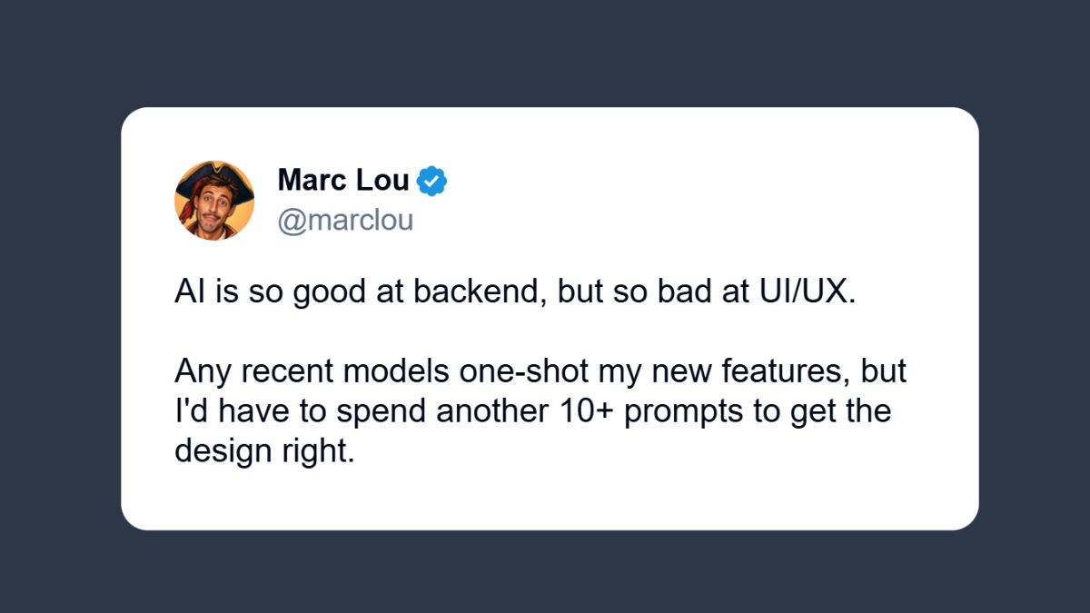
The tweet above is from Marc Lou, a well-known solo founder on X who has built and launched multiple successful products. His observation captures something many builders are noticing in 2026: generating working code has never been easier, but generating interfaces that feel polished and trustworthy is still a real problem.
Marc isn't the only one saying it. Talk to any indie hacker shipping in 2026 and you'll hear a version of the same complaint.
The auth flow took an afternoon. The database schema took a prompt. The payment integration took a Stack Overflow tab and forty minutes. But the homepage has been in "almost done" for three weeks.
That gap, between what AI can ship and what AI can polish, is the whole reason this conversation matters. AI optimizes for patterns it's seen the most. Which means the more developers use it, the more interfaces start looking identical. Same grid. Same dark mode with one accent color. Same hero with a gradient.
Users have started calling it "AI slop design." And once they recognize it, trust drops before they've clicked a single button.
So when we talk about how to make an app look professional, we're really talking about how to escape that visual default. How to look like you built something, not generated it.
Why People Judge Your App in Seven Seconds
There's a number that gets thrown around in UX circles: somewhere between 50 milliseconds and 7 seconds is how long it takes a user to form an opinion about a website.
Whichever end you believe, the takeaway is the same. People don't read your features list before deciding whether to trust you. They look at the screen. They feel something. They stay or they leave.
This isn't shallow. It's just how brains conserve energy. Visual cues are the cheapest, fastest way to estimate quality, and our brains are wired to use them first.
So when a visitor lands on an AI tool with a generic layout, a weird font pairing, and three different shades of gray, the first thought is rarely:
"I wonder how elegant their vector embedding pipeline is."
It's:
"If they didn't care about the experience, what else didn't they care about?"
That's the trust gap. And it's expensive.
Same Functionality. Completely Different First Impression.
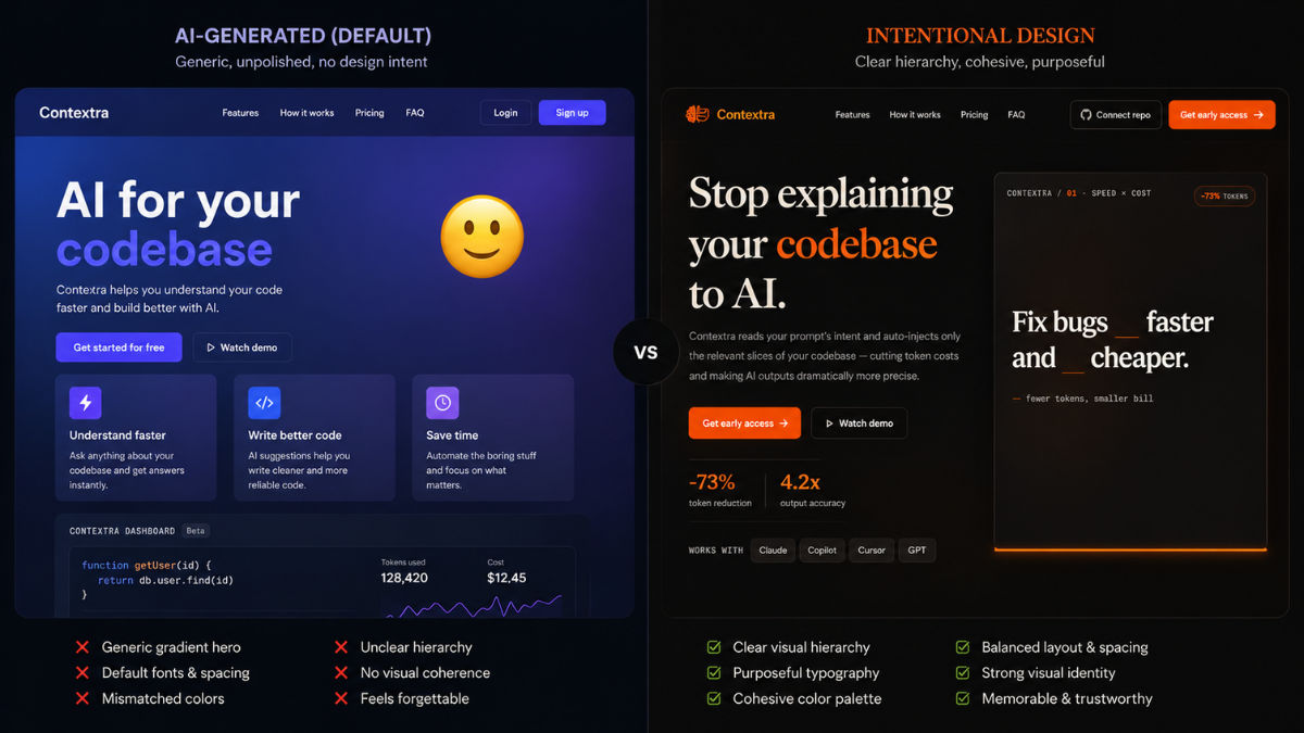
One version uses a generic AI-generated layout. The other uses an intentional visual design while keeping the same functionality underneath.
Look at the comparison above. The features are identical. The backend is identical. The actual product does the same thing in both cases.
But one of them looks like a real company built it. The other looks like someone forgot to finish.
That's why how to make an app look professional isn't really a design question. It's an uncertainty question. Users don't need beauty. They need a reason to believe you'll still be around next month.
The Cost of Looking Unfinished (And Why You'll Never See It on a Dashboard)
When something breaks, you find out. Stripe sends an email. A user opens a ticket. Sentry pages you at 2 AM.
Design failure is different. It fails quietly.
Nobody writes to say: "Your typography made me think this was a side project." Nobody fills out a survey explaining that your spacing felt amateur. They just close the tab. They never sign up. They forget you existed.
Your analytics will show a bounce rate. They won't show you why.
That's the hidden tax of an unprofessional-looking app. You lose users who would have loved your product, and you lose them silently, which means you'll probably blame the wrong thing.
I've watched this happen with calculators, AI wrappers, dashboards, dev tools, niche SaaS products. The functionality was there. The value was real. But people kept leaving before they discovered it.
What You See vs. What Users See
A founder looks at their product and sees:
- Six months of effort
- An auth system that took two weekends to get right
- A database schema they're quietly proud of
- The edge cases nobody else thought to handle
- The clever caching layer
A user looks at the same product and sees:
- Fonts
- Buttons
- Spacing
- Colors
- Whether the page feels alive or abandoned
You're evaluating your work based on what it cost. They're evaluating it based on what they can see. Those are completely different yardsticks.
A Product Loses Trust Long Before It Loses Function
Analytics can tell you what users did. They can't tell you why someone bailed in three seconds. That signal lives outside the dashboard, which is why it gets ignored, and why most founders underinvest in fixing it.
When trust drops, conversions follow. Not always dramatically. Just a steady leak that's hard to attribute. Until one day you realize a competitor with worse functionality is outselling you, and you start wondering what they figured out that you didn't.
Usually, they just figured out how to make an app look professional without rebuilding it.
Why Most Developers Don't Fix This (Even When They Know Better)
Most developers don't ignore design because they think it doesn't matter. They ignore it because there's always something more urgent in front of it.
A bug in production. A user asking for a feature. A query that needs an index. A failing webhook. Design feels optional in a way nothing else does, because the product still technically works without it.
So the work stalls at 90%. The functionality is done. What's left isn't engineering. It's typography, spacing, hierarchy, color, rhythm. The stuff most engineers actively dread.
Building Software and Designing Software Aren't the Same Job
A great backend engineer isn't automatically a great designer. The reverse is also true. Both skills take years of deliberate practice, and they exercise completely different muscles.
The unfair part of being a solo founder in 2026 is that you're expected to do both. Plus the marketing. Plus the support. Plus the launches on X. Design getting deprioritized isn't a character flaw. It's a math problem.
"Just Learn Design" Is Worse Advice Than It Sounds
Whenever someone says "just learn UI design," they're underestimating what that actually involves. Real design competence requires understanding:
- Typography (not just fonts, but pairings, scale, rhythm)
- Visual hierarchy
- Spacing systems
- Color theory and contrast
- Accessibility
- Interaction patterns
- User psychology
That's not a weekend. That's a second profession. And for most founders, it's not where the competitive advantage lives.
Your edge is the problem you solve. Not your ability to pick a font pair.
The Three Things Founders Usually Try (And Where Each One Breaks)
Once you accept that the product needs to look better, the question becomes: how? In practice, there are three common paths people take.
1. Hire a Designer
This is genuinely the best option, if you can afford it and you have time to manage it.
A good designer doesn't just decorate. They establish hierarchy, fix usability issues, build a system you can extend, and make your product feel like a real company built it. For funded startups or established businesses, this is usually the right investment.
For solo founders shipping a $9/month tool? Not so much. A decent designer for a small project starts around $1,500 and goes up fast. Then come the meetings, revisions, async Loom feedback loops, and the implementation handoff. By the time it's done, you've spent more on the redesign than the product has earned.
2. Learn Design Yourself
Plenty of developers go this route. There are infinite Refactoring UI threads, Tailwind tutorials, and Dribbble shots to study. Free knowledge is everywhere.
The catch is that consuming design content and having a design eye are different things. The eye comes from years of building, breaking, and rebuilding. You can shortcut some of it, but not all of it.
A lot of founders spend three months on this before quietly admitting they'd rather be working on the product. Which is the right instinct.
3. Rebuild the Frontend
This one's seductive in the AI era. The product works, but the interface feels off, so the founder decides to start over. New stack. New component library. New design system. New everything.
Six weeks later they're debating button radius instead of talking to customers, and the original product, which was fine, is still half-redesigned.
Rebuilding the frontend to fix a presentation problem is almost always more work than people expect, and it pulls focus from things that would actually grow the business.
What All Three Have in Common
Notice what every option above assumes:
The interface has to be rebuilt.
But that's not always true. Most of the time, the product already works. The forms work. The dashboards work. The workflows make sense. The thing that's broken isn't the product. It's how the product presents itself.
That distinction matters, and it opens a fourth option most people overlook.
The Fourth Option: Change the Wrapper, Not the Product
If your product works but doesn't look like it works, you have a presentation problem. Not a product problem. Not a feature problem. A wrapper problem.
And wrappers are way easier to swap than products.
Think about what's actually missing from a typical AI tool or indie dev project in 2026. The prompt logic is fine. The API calls are fine. The output is genuinely useful. What's missing is the layer between the user and the value. The visual signal that says "this was built on purpose."
That signal is mostly CSS. Some typography choices. Some spacing decisions. A coherent color system. Buttons that look intentional instead of default. None of which requires touching your backend.
Most Products Don't Need More Features
Founders default to building more when conversions disappoint. Lower signups? Ship a feature. Lower retention? Ship a feature. Lower engagement? You guessed it.
Sometimes that's the right move. But often, the product is already valuable enough. Users just aren't sticking around long enough to find out. In that scenario, more features won't help. A better first impression will.
Before you build another thing, it's worth asking: would the same product convert better if it simply looked like it cost twice as much?
In my experience, the answer is yes more often than founders want to admit.
Presentation Is the New Differentiation
Something shifted in the last two years. Functionality used to be the hard part. It isn't anymore. Anyone with a Claude tab and a weekend can ship a working product.
Which means functionality is no longer how users separate the winners from the rest. Presentation is. Not in a "make it pretty" way. In a "make it feel real" way. Confidence. Clarity. Intention. The kind of thing that takes three seconds to convey and an entire team to fake.
That's why how to make an app look professional has moved from a nice-to-have to a core skill. The bar to ship is on the floor. The bar to be trusted keeps rising.
A Different Question Changes Everything
Instead of:
"How do I redesign my application?"
Try:
"How do I make my existing application look like a real company built it?"
These sound similar. They're not. The first is a development project. The second is a presentation project. One is months of work. The other is hours.
A Practical Example
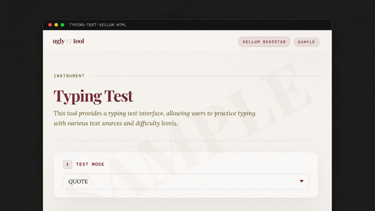
The functionality is unchanged. The backend is unchanged. Only the visual presentation changes.
This is part of why tools like UglyTool have started showing up in indie hacker feeds. The idea isn't to replace your product. It isn't to rebuild it. It's to drop a polished presentation layer on top of what you've already built.
You paste your URL. It scans the visible interface. You pick from a few professionally designed themes (something like a warm research-grade look, a dark amber late-night-builder vibe, or a clean clinical-precision style) and you get a styled version of your app back in seconds. No source code uploaded. No backend touched. No framework migration.
You're not learning design. You're not rebuilding your stack. You're just borrowing taste from people who already have it. For a one-time fee that's cheaper than a designer's first reply email.
For solo builders trying to make an app look professional without losing two weeks to it, that math works.
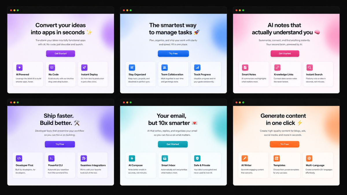
Despite being built by different founders for completely different use cases, many AI-generated products share remarkably similar visual patterns. Escaping that default is most of the battle.
Your App Probably Doesn't Need Another Feature
Most founders, when growth stalls, assume the product is the problem. The instinct is to ship more.
Sometimes that's right. Often it isn't.
After watching this play out across dozens of small products, I've come to believe most of them already provide enough value. Users just don't stay long enough to feel it. They can't appreciate features they never reach. They can't trust products they abandon in three seconds. They can't experience your engineering if they bounce off your first screen.
That's why learning how to make an app look professional isn't about vanity. It's about removing the things standing between users and the value you've already built.
The Bottleneck Moved
For most of software's history, building was the constraint. You either knew how to ship, or you didn't.
In 2026 that's no longer true. AI can write the code. Modern frameworks handle the complexity. Open-source covers the rest. The constraint isn't building anymore. It's standing out.
When everyone can build a thing, the thing that breaks the tie is the thing that's hardest to fake: a product that feels intentional. Clean. Maintained. Confident. The kind of confidence a user picks up in a single glance and uses to decide whether you're worth their time.
Professional ≠ Pretty
When developers hear "design," they often picture trendy animations and award-winning landing pages. That's not what this is about.
Users don't want pretty. They want certain. They want to feel like the product they're about to use is reliable, maintained, and not going to vanish next month. A professional-looking interface communicates that before they've understood a single feature.
You're not designing for designers. You're designing for trust.
The Real Goal
The goal isn't to win design awards. It isn't to impress your friends in design school. It's not even to make the prettiest version of your product.
The goal is much simpler: get out of your own way. Stop letting presentation be the reason users miss the value you've already built.
Because in a year when shipping software has never been easier, the products that win aren't the ones with the most features. They're the ones that earn the user's trust in the first three seconds.
If you can do that, whether by hiring help, learning the craft, or borrowing someone else's taste off the shelf, you've solved most of the problem. The rest of the work was already done. It just needed somewhere good to live.
That's really all how to make an app look professional comes down to in 2026. Not artistry. Not aesthetics. Just refusing to let your work look like everyone else's.
Frequently Asked Questions
You don't have to redesign your product to make it look professional. Most of what users perceive as "professional" comes from typography, spacing, hierarchy, and a consistent color system. You can get most of that without a designer by using a polished design system (like shadcn/ui or Tailwind UI), a curated theme service like UglyTool that wraps your existing app in a professional look, or by studying a single reference site and copying its visual decisions consistently across your own. The goal is not artistry. It is removing the visual cues that scream "unfinished."
Because AI design tools optimize for patterns that appear most often in their training data. That means the same gradient buttons, the same card layouts, the same dark mode with one purple accent, the same hero with a floating emoji. Indie builders have started calling this "AI slop design." Users have learned to spot it instantly, and once they do, trust drops before they have clicked anything. The fix is rarely more AI. It is borrowing taste from sources outside the default.
For a funded product or an established business, almost always yes. For a $9/month tool or a weekend project, usually no. A competent designer for even a small project starts around $1,500 in 2026, and the real cost includes revision cycles, async feedback, and implementation. For most solo founders, a one-time design template, a UI kit, or a presentation-layer service gives you 80% of the result for a fraction of the money and time.
"AI slop design" is the term builders use for interfaces that immediately read as AI-generated. Common signs include generic gradient hero sections, identical card grids, default Tailwind palettes, and the same three SaaS layouts recycled across thousands of products. You avoid it by introducing intentional choices the AI default would not make: a non-default font pair, a non-default color system, real typographic hierarchy, and consistent spacing that follows a clear rhythm. Even one or two of these is often enough to escape the default.
Yes, and in most cases that is the better path. If the product works, the database works, and the workflows work, you do not have a product problem. You have a presentation problem. Tools like UglyTool let you paste your live URL and get a professionally styled version of the same app in seconds, without touching your backend, your source code, or your stack. For builders using Streamlit, Gradio, or plain HTML, this is often the fastest way to make an app look professional without weeks of redesign work.
Costs vary widely depending on the path you take. A custom designer for a small project starts around $1,500 and goes up from there. A design system or UI kit typically costs $50 to $300 one time. A drop-in theme service like UglyTool costs $19 for a single look or $39 for a full catalog as a one-time fee. Learning design yourself costs nothing in dollars but usually takes months to produce results that match what a designer or template ships in a day.
Featured on ProductArena
The products mentioned in this article are quality, early-stage products featured on ProductArena. We highlight promising tools while they're still in their early days, so you can be among the first to discover and use them.